Firely
A personal-finance SaaS landing page that turns a dense dashboard product into a clear, calm first impression.
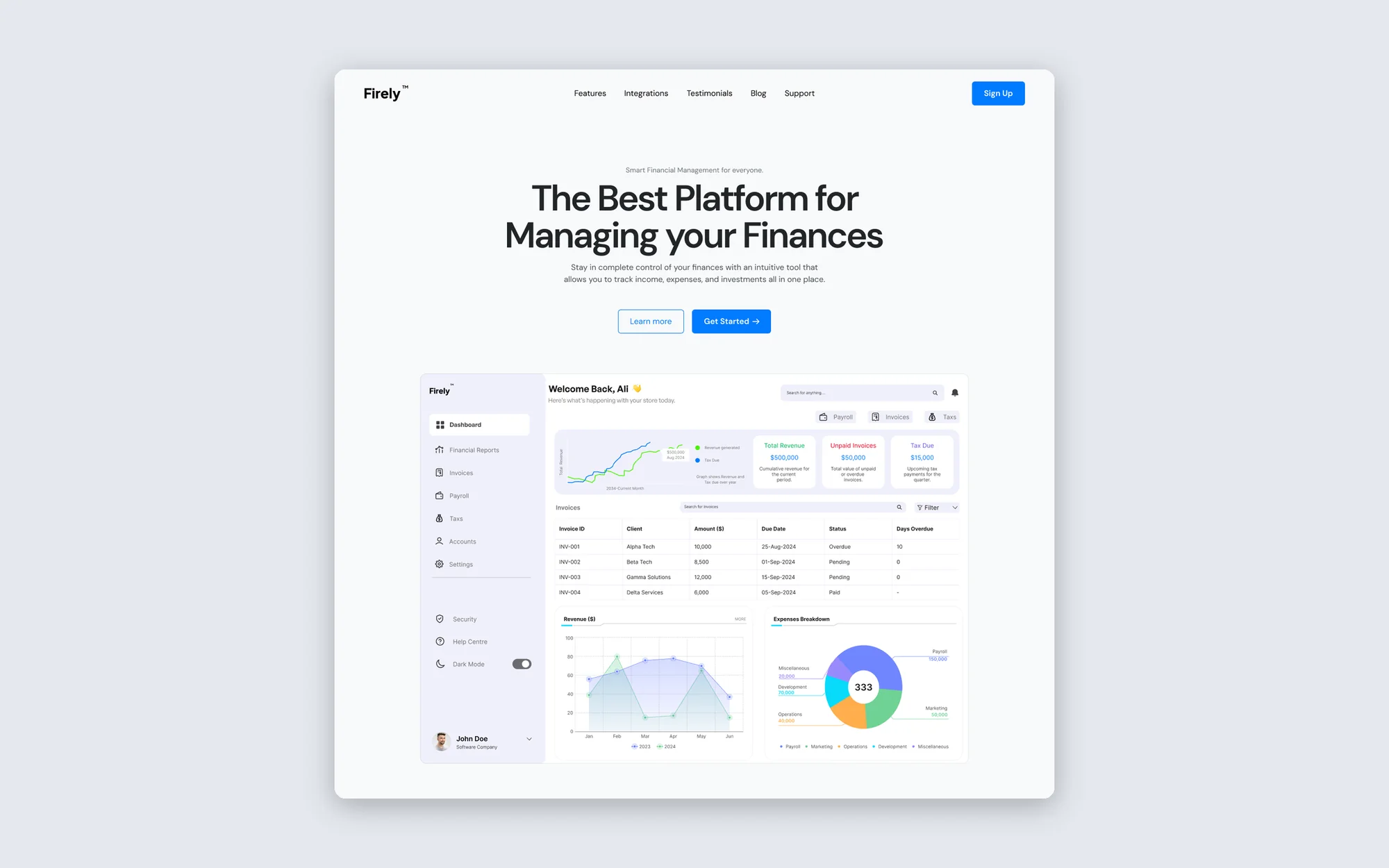
Firely is a fictional money-management app: budgets, expenses, invoices and investments in one dashboard. The task was to design and build its marketing landing page — the page that has to explain a data-heavy product in a few seconds and get a visitor to sign up.
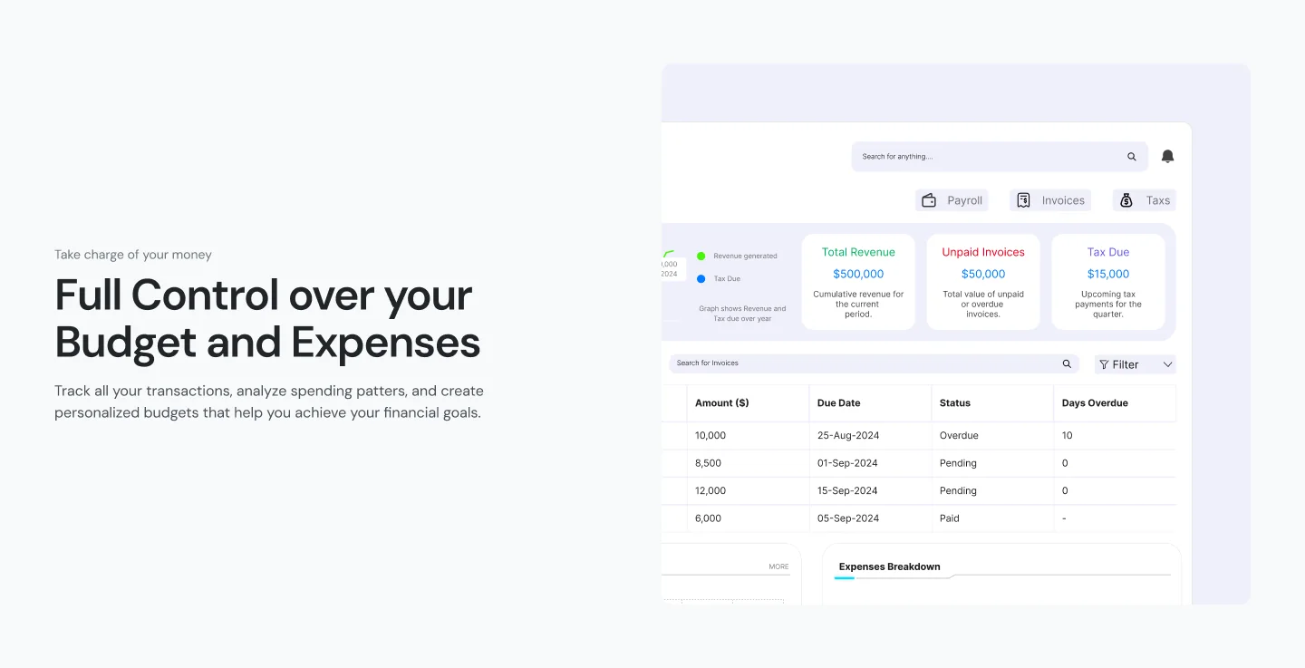
The challenge
Finance products fight two problems at once: they need to look trustworthy, and they need to look simple. A screen full of tables does neither on its own.
The goal was a page that leads with one clear promise, shows the real product early, and then breaks it into three easy ideas — control your budget, invest smarter, see the results — before a single, repeated call to action.
The approach
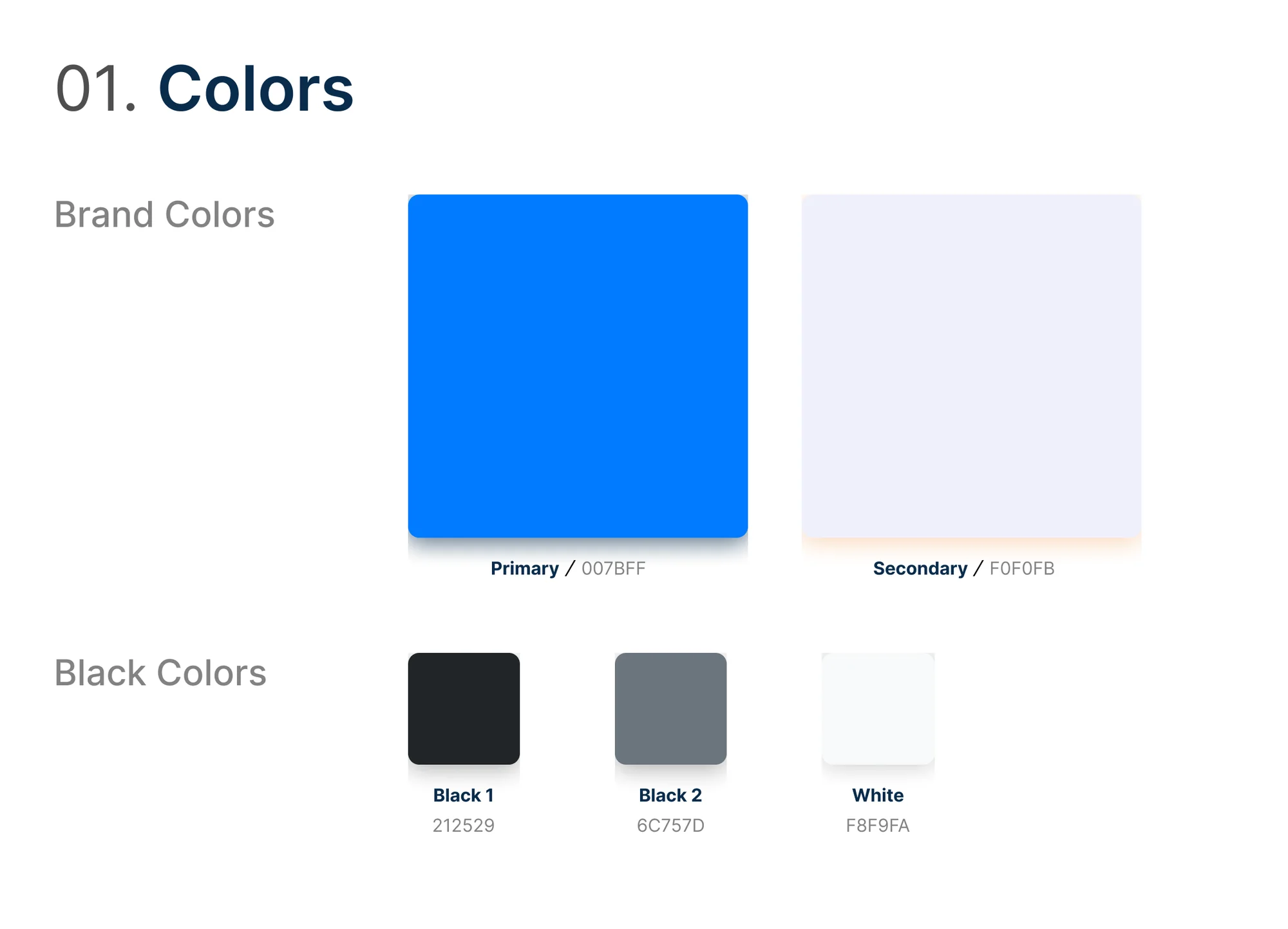
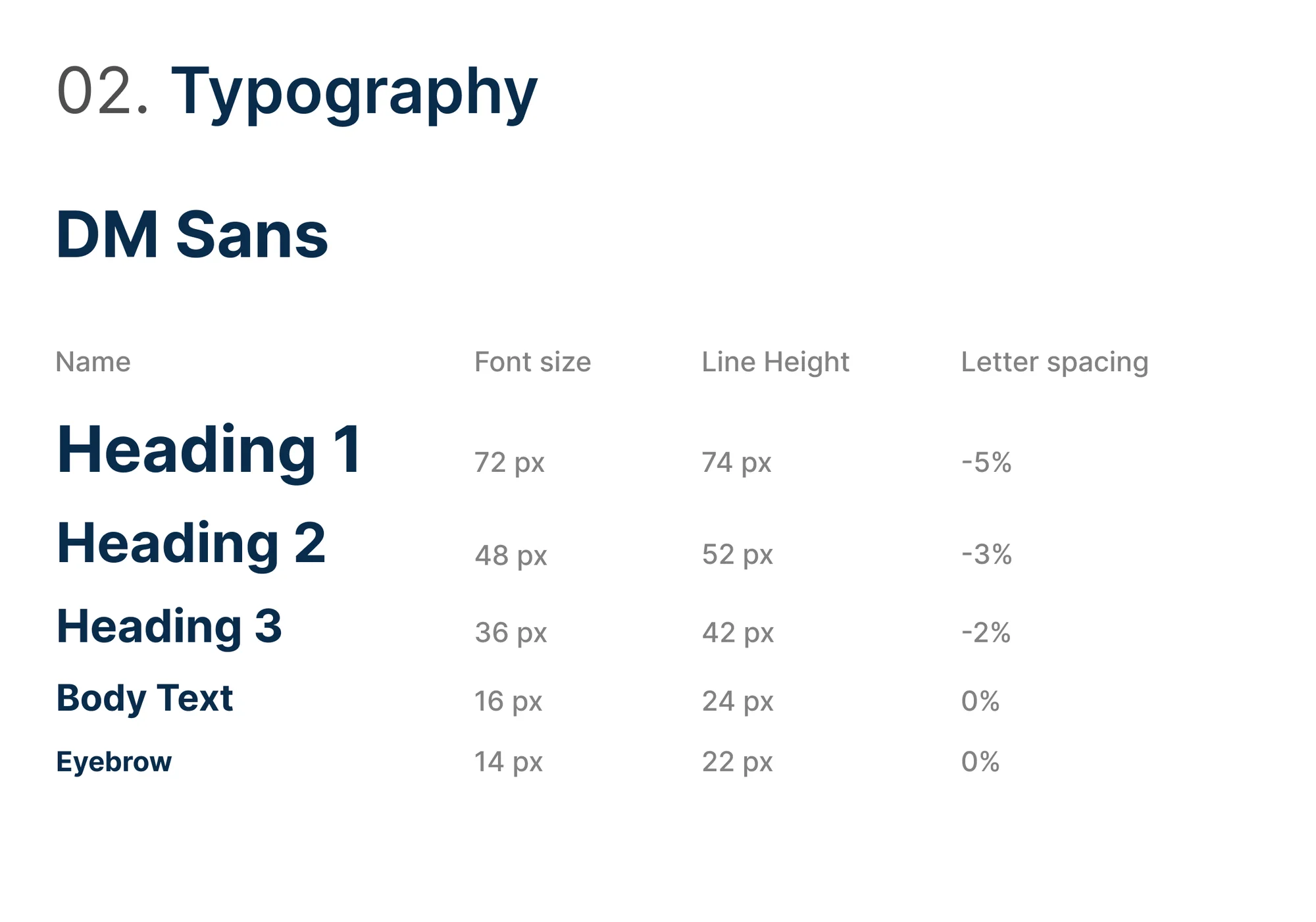
I started with a small design system in Figma: a calm off-white base, one confident blue reserved for actions, a strict type scale and spacing tokens. Every button on the page uses the same blue, so the next step is never in doubt.
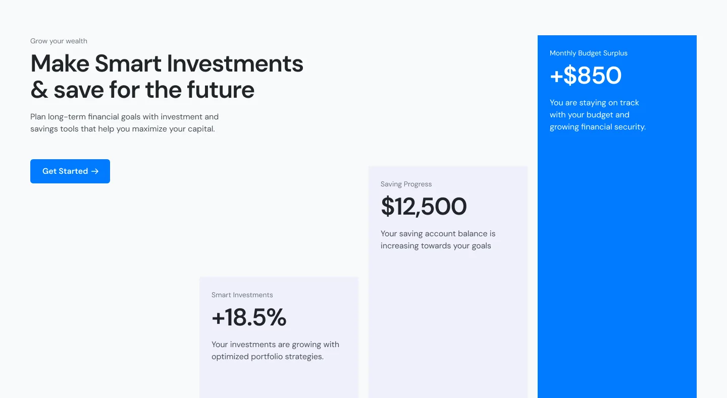
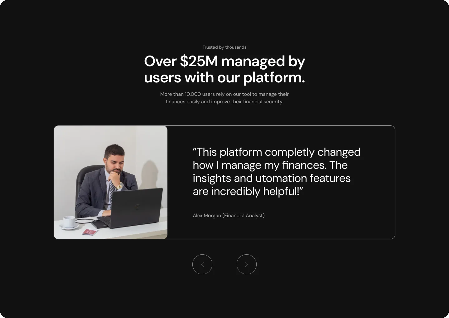
The hero puts the dashboard directly under the headline, so the product sells itself. Feature sections alternate text and UI crops, and the investment block uses large stat cards instead of charts so the numbers read at a glance. A dark social-proof band breaks the rhythm before the final call to action.
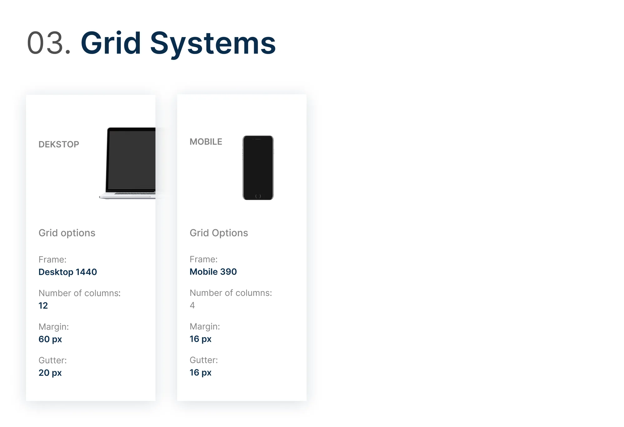
In Webflow I built it with a class-based system, fluid type and spacing, and separate tablet and mobile layouts rather than a squeezed desktop.
The outcome
A complete, responsive landing page live on Webflow, built from a reusable component set that could grow into a full marketing site. The page keeps one primary action visible at every scroll depth and stays light enough to load fast on mobile.


Lighthouse scores
Measured on the live site with Google Lighthouse (mobile).

Want a site like this for your brand?
Book a free 30-minute discovery call. You’ll talk directly to the person who designs and builds your site.